Windows v2.5 font to small, I cannot read my vital numbers. Help.

WarMongerian

Scavenger
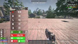
Ok, so. the health and stanimia numbers need to be made as big as they used to be in v2.4. Right now I cannot read them in game, and the dinky numbers below them also need to be the same size. Visually impaired folks need them big number fonts, lol.QWERTU.jpg
Even at 200%, the food and water are clearly smaller than the stanumia and Health. is there a setting where I can make them larger?
 
Because the food and water are on the same line taking up half the space as the stamina and health I don't think they can be made the same size. May have to wait for a mod to separate them to different lines so they are same as the other two.
 
Because the food and water are on the same line taking up half the space as the stamina and health I don't think they can be made the same size. May have to wait for a mod to separate them to different lines so they are same as the other two.
Is there no setting I can change, to increase the size of the font?
 
So, no control setting will help make the font size bigger? I'm a visually challenged player, so i have to be close to the zombies to see/hit them, and that means a melee attack, and that uses stanimia, and since they reduced the font size, I have not been able to see how much stanimia I have. I have died twice, since v2.5 went live, because I try to kill me some zombies, but since I cannot see if I have any stanimia left, my life/game ends early.

Any one able to help we get the font size bigger, or help me go back to v2.4?

In steam/Library/7dtd/Properties/Betas/Beta Participation choose V2.4 in the drop down and let the game update. You won't be able to play your 2.5 game in 2.4 though.
 
Unfortunately, UI/HUD stuff normally has one design/layout and you're stuck with it unless you use a mod to change it. Even when there are multiple to choose from within the game itself, you don't normally have much control over specific details and can only choose from a selection of UI/HUD layouts. So you're probably going to have to look for someone to make a mod for it, unfortunately.

I don't really like the new layout at all. I don't like the smaller health and stamina bars from what they used to be (really just the stamina, but I'd still prefer they both were back to what they used to be), and I don't like the water/food under them. I would be very happy to have them back under my toolbelt and just make the bars double the height they used to be so they are easier to see. That wouldn't really take up any significant amount of space and would be plenty for me. I'm hoping someone will make that kind of UI/HUD mod at some point.

In the meantime, I'd suggest ignoring the numbers. The numbers really don't matter anyhow. I rarely look at the numbers on any of the bars. As long as you can see how full or empty it is, you have enough information to determine if you want to eat or drink something or heal or rest. Not what you're looking for, I know. But it is at least something if you don't want to wait for who knows how long until someone makes a UI/HUD mod that works for you. That could potentially be months or even over a year depending on if anyone feels like making one.
 
In steam/Library/7dtd/Properties/Betas/Beta Participation choose V2.4 in the drop down and let the game update. You won't be able to play your 2.5 game in 2.4 though.
I'll see if I can get that setup. If not, I'll wait for one of my friends to come on discord, and help me get that setup.
Post automatically merged:

In the meantime, I'd suggest ignoring the numbers. The numbers really don't matter anyhow. I rarely look at the numbers on any of the bars.
Unfortunately, the color they are using for the bar is all but invisible to my eyes, so only the numbers were of use in v2.4
 
Back to v2.4, for comparison:
v2.4 size.jpg
QWERTU.jpg
These images are both 200% blow ups. My eyes can see the health bar, but the stanimia bars color is extremely hard to see, with my eyesight, hence why I am dependant on the numbers being big enough to see them.
 
It's easy to change the bar color. Open ...\Data\Conig\XUi\windows.xml and find this line in the Stamina section (it's line 27 in the current version). Change the color values to something you can see better, this part color="0,54,255,160". That's RGB and intensity(?).

<filledsprite depth="5" name="BarContent" color="0,54,255,160" width="169" type="filled" fill="{statfill}"/>

I've changed the bar color in the image below (middle). Sorry if that's a color you can't see well.

It's also not hard to change the font size. The trouble is getting all the rectangles positioned and lined up. I've increased the font size but messed up the bar location, as you can see on the right. Someone that knows how the positioning works could probably whip up something fairly quickly, but for me it's mostly trial and error. I could maybe work on something but it would take a while.

staminabar.jpg
 
I just noticed something else. In your screenshots it looks like your UI opacity isn't that high. In Options\Video Settings\UI you can turn up UI Background Opacity which will make the bar more opaque, and the foreground will help with the text. I set these to 95 and 100. At 95 background I can still detect movement through the inventory screen but it's easier to see the content icons.
 
Back to v2.4, for comparison:
View attachment 37755
View attachment 37756
These images are both 200% blow ups. My eyes can see the health bar, but the stanimia bars color is extremely hard to see, with my eyesight, hence why I am dependant on the numbers being big enough to see them.

I use to have trouble with the old bars that were above and below the tool belt. I eventually edited them so they were at least double the thickness so I could easily see them. Then later I just picked a mod that let me change the position of them back to the left.
 
I just noticed something else. In your screenshots it looks like your UI opacity isn't that high. In Options\Video Settings\UI you can turn up UI Background Opacity which will make the bar more opaque, and the foreground will help with the text. I set these to 95 and 100. At 95 background I can still detect movement through the inventory screen but it's easier to see the content icons.
If I'm understanding this correctly, then this is what the things look like with 100% Opacity:
v2.4 size.jpg
With the slightly darker background, and blowing up to 200% I can just about see the bluish bar, but it is far easier to read the numbers. I need ~20 or so stanimia for each swing, and 2-3 swings/zombie, so If I attempt to go in a-swinging, and I only have enough for 0-1 swings, all I do is manage to give my little digital dude is, to enjoy a bit of quality alone time with a zombie that gets to hit him at least once.
Post automatically merged:

I use to have trouble with the old bars that were above and below the tool belt. I eventually edited them so they were at least double the thickness so I could easily see them. Then later I just picked a mod that let me change the position of them back to the left.
I was never able to see them in actual play, I just had to open up the B key, and select the health stats. No go for on the run, but as long as you are safe for a few seconds, it worked for me.
 
Last edited:
I edited the windows to try to get a high contrast scheme
I based it on red and green because that is what WarMogerian can see clearer.
This is the result, not perfect but maybe useable
windows.png
........................................Night.......................................................................................Day
 
I also messed around with it some, trying to better understand the window layout system. Is there some window layout editor to make this WYSIWYG?

I doubled the size of most of the elements and changed colors. I think maybe double is a bit too much, especially compared to the rest of the UI. And those brighter greens and text too bright. Maybe less alpha. The composite screenshot below compares the size and colors. The buffs don't actually block the view as badly as it appears, it's just a different angle.

Edit: I do have this as a mod I could post.
 

Attachments

  • biggerstats.jpg
    biggerstats.jpg
    1.1 MB · Views: 6
Back
Top