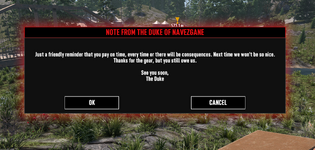
Pop up message justifying left

arramus

Refugee
Version
V3.0(b257)
Platform
Windows
It appears that V3 (b257) is justifying left for pop up message windows.
I don't recall that in the previous build. Just checking if it's intended.

utMwCiE.png
 
Reproduction Steps
Observe Pop Up windows typically with a single option tab.
Link to Logs
https://pastebin.com/5V0jn3xr
Link to Screenshot/Video
https://i.imgur.com/utMwCiE.png
Hi there, is the popup hanging on your screen for an unusual amount of time? The multiplayer privilege windows is present in older versions as well but maybe not as noticeable since the new UI update makes it far more visible now. The time it remains on screen can vary as well I've found while the game loads but it should still disappear quickly, typically within a second or two. Let me know if this answers your question and I'll move the thread to "needs more info for now". Thanks!
 
The Pop Up Window disappears almost instantly when joining a server or SP.
I've noticed it in the past, and I believe it was centered text. It just stood out.
 
Another example of mixed justifying is this Pop Up.
ns5WZgU.jpeg


In a Pop Up with double options, such as Cancel < > Accept, it looks balanced.
In these single options, things are shifting left. In this case the text is centered with only the option justifying.
 
The UI has been updated in V3.0 this is an intended feature.
It is intended to have everything centered and the OK button not centered (see the post above yours)? That seems a strange choice if true. Fully left or fully centered is fine, but a mix is weird.
 
It is intended to have everything centered and the OK button not centered (see the post above yours)? That seems a strange choice if true. Fully left or fully centered is fine, but a mix is weird.
Yes, to be fair I am going through some of the UI to see if they can be improved and centered in some cases however the UI has been updated and will not look like the previous UI like the original post mentions. I'm making a ticket for the developers to make some improvements if necessary on the UI that could be centered.
 
It may take a bit to compile them all since there have been updates to UI let me know if you find any others so I can add them to the report, thank you.
 
Since development has been a 'relatively' long period, there have been a variety of changes to how we interface with things and it can be quite a patchwork at times.

The Server Information panel shifts the title and body to the left, with the options to the right. I appreciate this is dated.
kSfD1Oc.jpeg


The trend to shift left with updated content is more apparent, especially with the 'Back' tab being the first thing leftward in all cases.
PHnjPDn.jpeg


Except for when it isn't, and 'Back' is no longer the preferred option to go back or leave the screen.
c5B8EN9.jpeg


And an expected 'Back' justified left, with 'Manage Saves' shuffled along a little, and a 'Start' tab tabbed along a little.
GtmKpmN.jpeg


For any community mods, and we appreciate it's not really priority, it can start things off a little odd, depending on what base game prompts are used.
KiU13Wy.jpeg


I get that design rules don't need to be rigid, and we'll ultimately get used to whatever is offered, but it's a chance to give feedback for something new which is finding its place where multiple design rules still appear to apply from past builds.
 
Back
Top