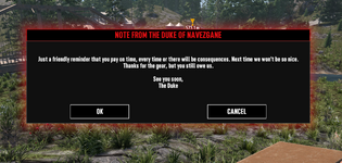
Since development has been a 'relatively' long period, there have been a variety of changes to how we interface with things and it can be quite a patchwork at times.
The Server Information panel shifts the title and body to the left, with the options to the right. I appreciate this is dated.
The trend to shift left with updated content is more apparent, especially with the 'Back' tab being the first thing leftward in all cases.
Except for when it isn't, and 'Back' is no longer the preferred option to go back or leave the screen.
And an expected 'Back' justified left, with 'Manage Saves' shuffled along a little, and a 'Start' tab tabbed along a little.
For any community mods, and we appreciate it's not really priority, it can start things off a little odd, depending on what base game prompts are used.
I get that design rules don't need to be rigid, and we'll ultimately get used to whatever is offered, but it's a chance to give feedback for something new which is finding its place where multiple design rules still appear to apply from past builds.